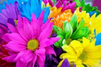
 A Miami beach hotel with floor-to-ceiling sheer white drapes, white Carerra marble tile and chrome accents creates a cool, contemporary clean feeling while a stroll through a turn-of-the-century restored brownstone enveloped with jewel tones of midnight blue, emerald green and ruby red creates a warm, cozy, comfortable space. And a floral bouquet in spring made up of pink tulips, yellow freesia and blue hydrangeas is welcomed in April while a collection of apricot tiger lilies, eggplant colored calla lilies and red anthuriums is perfect for autumn.
The cool hues in the spring and the warm hues in the autumn arrangements touch an emotion; a feeling, as do the colors displayed throughout your home.
When it comes to interiors, most of us know what we like when we see it, but we don’t know exactly why we like what we see. Often times a client will show me a magazine clipping exclaiming how they love a particular room but upon closer inspection, they really don’t like the sofa, the area rug or the window treatments. The parts do make the whole, but often times that theory doesn’t work when talking about interior spaces. I find clients are drawn to the feeling they get from the magazine photo; it’s not necessarily the details in the photo that are desired, but the way things are pulled together and the colors used create that feeling. You, too, could create the feeling you so desire in your personal space.
Once you have determined the feeling you want to achieve, it helps to understand the way colors work. There is a cool and warm value to almost all colors. If not carried in the particular color (i.e., white or black), the colors used around its environment reflect a value within. For example, there is a cool and warm in blue and a cool and warm in green. The “coolness” or “warmth” is created within the intensity of a particular color.
The color saturation (see color terms and definitions at the end of this article) defines the hue. If you look at a purple that is highly saturated, you’re looking at an “Eggplant” (deep dark plum), which renders a warmer feel; it’s dramatic and powerful. A purple with very little saturation creates a hue that may be called “Iced Lilac” — a color that is bright, lively and cool — ideal for a nursery.
Of course you can combine light and dark tones within the same space but it’s the proportion of the particular color dictating the overall feeling. Imagine a nursery adorned with hand-rubbed “iced lilac” walls, an imperfect, rustic painted white wood floor and an antiqued wood spindled crib with a honey tone wood rocking chair. The area rug may carry those colors along with mid-toned shades of pink and purple. Perhaps the sheers lightly covering the widows are also in a mid-toned purple. All of this works because the proportions are clearly defined — the majority of colors are light and soft and tinted while the accent colors are darker. When the colors are kept close enough in value (intensity), the interaction is soothing; it works because of the careful balance.
When selecting colors, there really isn’t a right or a wrong choice. The colors you select should define who you are and what feeling you’re trying to create. In my opinion, the biggest misconception is when people run away from using dark colors in small spaces.
The most beautiful powder room I have ever seen was in 1992 in a showcase home while I was in Design School. The designer selected black upholstered walls for the smallest, tiniest bathroom I have ever seen in my life. It was an old Victorian home — not my particular taste, but it was a showpiece — totally ornamented and adorned with over-the-top accessories, oversized furniture and an abundance of details … it was simply magnificent! The powder room was powerful; it was deep, dark, sexy and outright dramatic. This misconception of avoiding dark colors in small places often times distracts folks from using a color that can add a lot of drama; either cool or warm. Design with the intention of creating a mood; a feeling and this will dictate your color within.
Here is a helpful list of terms used in the world of color:
Hue: defines the property of color. This is usually what we mean when we ask “what color is that?’
Saturation: describes the intensity of a hue/color. Either a weak or strong color; pale or strong. Think color absorption.
Value: refers to the brightness of a hue; light or dark. Values are “higher” or “lower” than others depending on how close they are to white. For example, canary yellow is higher in value than charcoal grey since yellow is closer to white than charcoal.
Luminance: a lightness a color gives; obviously lighter colors contain a luminance about them; a sheen or brightness.
Tint: when white is added to a color, it is tinted
Tone: the application of black to a color
Shade: adding gray to the color
Helen Babilla is a certified Interior Designer out of Chicago, IL; www.babilladesigns.com. She contributes to TheSavvyGal.com once a month and is ready to answer your decorating questions. Next month: She answers Q&A; send your questions to thesavvygal@thesavvygal.com
